Brand Direction Review

Enter the team password to view the palette options.

AavatAI — Internal Review

Brand directions
for your review.

Each version is a fully functional landing page. Browse through them, note what feels right — bring your reactions to the alignment call.

Same product.
Different brand signals.

Every direction uses the same layout, copy, and structure. The only variable is the colour palette and the emotional register it creates. Click through each and notice your gut response — what does it feel like to be a buyer landing on each one?

Direction 01

Direction 01

Quiet Authority

Warm near-black hero anchors the first impression. The body opens into parchment — premium stationery warmth. Forest teal is the single accent: growth, reliability, considered innovation. Directly contradicts the AI category default without looking like it's trying to.

Cross-vertical Warm + human Most versatile
View Direction 01 →
Direction 02

Direction 02

Stone & Copper

Deep warm stone hero with aged copper as the accent. Copper references private banking and specialist legal visual codes — the most distinctive palette of the four. Nothing else in the AI avatar category looks like this. Highest differentiation, strongest material quality signal.

Legal + finance focus Most distinctive Material premium
View Direction 02 →
Direction 03

Direction 03

Editorial Light

Light from the first pixel — warm white dominant, charcoal text, teal accent. The most transparent and open of the four directions. Reads like a trusted publication rather than a tech product. Visually contradicts every competitor simultaneously — they all default to dark.

Healthcare + wellness Maximum contrast Bold move
View Direction 03 →
Direction 04

Direction 04

Deep Credibility

Cool near-black hero — more precise, more institutional than Direction 01. Platinum body surfaces. Warm brass is the single accent: the only warmth in a controlled, authoritative palette. Highest trust signal for conservative buyers. Finance and legal first, then scale out.

Finance + legal Institutional authority Conservative buyers
View Direction 04 →
Direction 05 — Space Edition

Direction 05

Quiet Authority + Space

Direction 01 as the trust foundation — with three space texture layers added. Slow starfield drift and a precision coordinate grid in the hero. The Web3 section transforms into a full deep-space environment: near-black background, teal nebula glow, denser starfield, glowing card borders. The rest of the page stays restrained and professional.

Space texture layer Web3 full expression Trust + futurism

This is the version that responds to Aziza's instinct for space and futurism — without sacrificing the trust palette that traditional buyers respond to. The space aesthetic appears where it's earned: hero texture, and the Web3 section as a full environmental shift.

View Direction 05 →
Direction 06 — Navy & Gold

Direction 06

Navy & Gold

Deep institutional navy hero — cooler and more precise than the warm near-black directions. Lean gold accent: the visual language of private banking, specialist legal, and financial services. White body with cool platinum surfaces. The most establishment-credibility signal of all six directions.

Finance + legal Blue-chip signal Highest authority

Responds to the Body Transformation Institute reference — the navy+gold palette translated into B2B AI service territory. The warmth stays in the gold; the navy keeps it institutional rather than wellness-adjacent.

View Direction 06 →
Direction 07 — Precision Dark ✦ New

Direction 07 — New Direction

Precision Dark

Rebuilt from first principles. Near-true-black alternating with pure white — no warm tones, no safe SaaS beige. Electric teal-cyan accent used sparingly: wordmark suffix and one CTA per section only. Apple-level section rhythm: each section has one job. Syne typeface on all headings — geometric, confident, architecturally precise.

New typeface — Syne Apple-style rhythm Electric teal accent Zero warm tones

A complete departure from Directions 01–06. New font, new palette, new section architecture. Dark hero with full-bleed portrait blend. Statement break between sections ("A service, not a tool"). The wordmark uses Syne Bold — "AI" in electric teal is the only accent in the nav. This is ElevenLabs-tier brand conviction.

View Direction 07 →

Platinum Intelligence Series

Four variations on a new brief: Bentley meets Apple Vision Pro. White-first hero, Playfair serif headings, Ice Steel accent — each direction shifts the palette temperature from warmest to coldest.

Direction 12 — Monochrome Intelligence ✦ New

Direction 12 — New Direction

Monochrome Intelligence

The Platinum Intelligence brief with the bronze stripped out — that warm champagne note was reading as "boutique SaaS." Now it's near-monochrome: porcelain, mist, silver, graphite, titanium. One clean Signal Blue accent, used rarely — a live dot, a focus ring, one CTA. White-first, frosted-glass nav, hairline dividers, system font. Apple, not creative agency. Looks expensive before it explains itself.

Zero bronze Single cool accent Apple-clean System font

The refinement of Directions 08–11: warmth removed entirely, the accent reduced to one restrained blue. If it ever reads slightly clinical, the cheapest fix is nudging Porcelain a touch warmer rather than reintroducing a metallic. Signal Blue is kept off small body text on purpose — contrast stays safe.

View Direction 12 →
Direction 13 — Monochrome Intelligence · Studio ✦ New

Direction 13 — New Direction

Monochrome Intelligence · Studio

Direction 12's palette, built out into a full landing page. The centrepiece is a "Choose your starting point" carousel — flip, swipe, drag, or arrow-key through five profession tones (Advisor, Counsel, Clinician, Agent, Protocol Lead), each a real studio-headshot presenter with a live chip. Then how-it-works, two feature splits, a single dark Web3 band, value-based pricing tiers, FAQ, and CTA.

Avatar carousel Full landing page Web3 vertical Pricing + FAQ

The "choose your starting point" interaction keeps the industry-first reframe — the cards are tones we tune to your brand, not a stock avatar gallery. Same restraint as Direction 12: white-first, one Signal Blue accent, a single dark moment for the Web3 band.

View Direction 13 →
Direction 14 — Monochrome Intelligence · Studio II ✦ New

Direction 14 — New Direction

Monochrome Intelligence · Studio II

Direction 13's full page, recombined. Under "Choose your starting point" it now uses the 3D rotating perspective carousel from Direction 11 (restyled monochrome, real studio headshots, click-centre-to-start). The "Start with your field" search panel and copy from Direction 12 are added back into the hero — so you can type your industry or flip the carousel, and the two are wired together.

3D carousel (D11) Search panel (D12) Full page (D13) Real headshots

Best of three: the immersive 3D card picker, the type-your-field search, and the full built-out landing page — all in the bronze-free Monochrome Intelligence palette. Picking a carousel card fills the search field and scrolls you to it.

View Direction 14 →
Direction 15 — Monochrome Intelligence · In Context ✦ New

Direction 15 — New Direction

Monochrome Intelligence · In Context

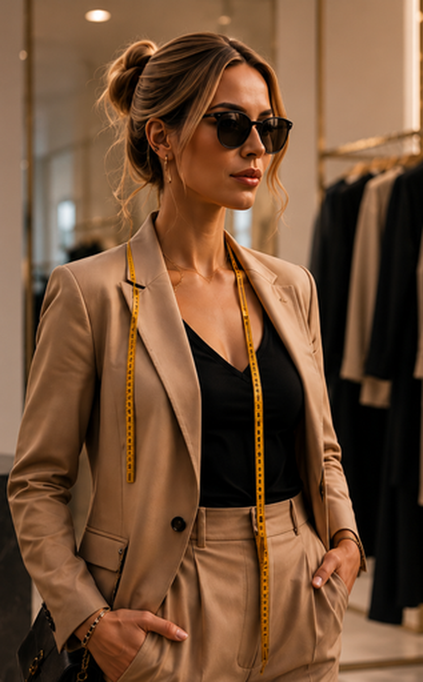
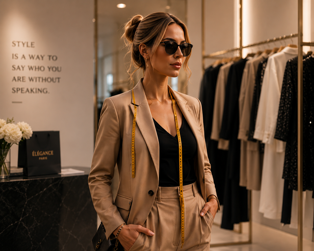
Direction 14's layout, but the presenters are now shown in context — in the office, the chambers, the clinic, the boutique, the gym, the nursery, the studio — holding the tools of the work, the way Direction 11's images do. This is the differentiator over flat talking-head services, and the page now says so directly. Nine industries in the carousel: the executive scenes (advisor, counsel, clinician, protocol-lead) were generated fresh; the property, fashion, lifestyle, fitness and sports scenes are the Direction 11 contexts brought back in.

In-context scenes 3D carousel Search panel Differentiator copy

Compare with Direction 14, which uses neutral studio headshots. Same Monochrome palette and layout; the only change is environmental, in-action imagery and the "not a talking head" messaging.

View Direction 15 →
Direction 16 — In Context · Carousel-Led ✦ New

Direction 16 — Redesigned layout

In Context · Carousel-Led

A UX-led reorder of Direction 15. The dynamic 3D carousel is now the hero — it leads the page with a tight value headline, since it's the most engaging element and explains the product instantly. The "Start with your field" search drops to a slim secondary band beneath it. New messaging throughout: a presenter is a face and a personality, not just a face. Web3 heading reworked to match.

Carousel-led hero Face + personality A11y: contrast + reduced-motion UX reorder

Accessibility passes from the UX review: a darker blue for small text labels (the bright Signal Blue failed contrast on white), focus-visible rings on the carousel arrows, and a prefers-reduced-motion block that stops the card float. Same nine in-context industries as Direction 15.

View Direction 16 →
Direction 17 — In Context · Offer & Pricing ✦ New

Direction 17 — Sales build

In Context · Offer & Pricing

Direction 16's carousel-led layout, now with real sales copy aligned to the actual deliverable. Adds a "What's in every build" section (trained identity, 10 stills, 3 talking clips, locked voice, brand bible, full rights), and a full product ladder with indicative pricing: Signature Build (from A$1,200), Managed Presence (from A$900/mo), Persona Intelligence (A$2,500 + A$750/mo), Storefront & Funnel (from A$2,500), plus a Signature Twin premium tier (from A$3,500) and Enterprise.

Sales copy Product ladder Indicative pricing Digital-twin tier

Copy reflects the proven deliverable from the Ava Mercer build spec — specialist-built, in-context, delivered in days, you own it, AI-disclosed. Pricing tracks business_model.md and is framed as indicative-for-scoping.

View Direction 17 →
Direction 19 — AAVATAI Warm Palette ✦ New

Direction 19 — Brand reskin

AAVATAI · Warm Palette

Direction 17's carousel-led sales page, restyled in the new AAVATAI brand palette — warm whites, sand & taupe, deep navy, soft/steel blue with silver-metallic accents — and a serif (Cormorant) wordmark and headings. "Warm · Human · Trustworthy · Future-Focused." Now carries the validated pricing floors from the research report.

New brand palette Serif wordmark Deep-blue metallic CTAs Validated pricing

Signature Build A$1,950 · Managed Presence A$1,200/mo · Persona Intelligence A$4,500 + A$900/mo · Storefront A$3,500 · Signature Twin A$5,000. See pricing_research.md for rationale.

View Direction 19 →
Direction 20 — Dark Mode ✦ New

Direction 20 — Dark system

AAVATAI · Dark Mode

Direction 19's full page shifted into a premium dark UI using the supplied dark token system: near-black navy base (#0F1D2D), lifted metallic-blue cards (#172A45), ivory/sand text, soft blue (#B9C8E0) reserved for calm highlights, and the metallic sheen on premium CTAs & hero only. Warm neutrals keep it human, not cold.

Dark mode Metallic premium CTAs Soft-blue highlights Full token system

Same content/structure as Direction 19, dark twin. Implements the provided --color-* dark tokens, element CSS, shadows and radii.

View Direction 20 →
Direction 21 — Blue & Silver ✦ New

Direction 21 — Restricted palette

AAVATAI · Blue & Silver

The dark template restricted to only the six blues & metallics — no warm neutrals. Deep Blue base, Deep Blue Metallic surfaces, Steel Blue borders, Soft Blue text/highlights, Silver Blue metallic premium CTAs, Graphite muted. A calm, monochromatic, premium silver-blue system. Premium buttons now use deep-blue text on light metallic (fixes the earlier white-on-silver contrast).

Blues + silvers only Monochromatic Light metallic CTAs Contrast-fixed

Same template as Direction 20, six-colour restriction (#0F1D2D / #172A45 / #3D5570 / #B9CBE0 / #AAB7C6 / #7D868F).

View Direction 21 →
Direction 22 — Light Blue & Silver ✦ New

Direction 22 — Restricted light

AAVATAI · Light Blue & Silver

A LIGHT theme built only from the six blues & metallics — no warm neutrals. Soft Blue page, Silver Blue section bands, Deep Blue text, Steel Blue accents/links, and the deep metallic reserved for premium CTAs & the dark Web3 band. Airy, cool, premium — the light sibling of Direction 21.

Light theme Blues + silvers only Steel-blue accents Dark premium CTAs

Soft Blue #B9CBE0 base · Silver #AAB7C6 surfaces · Deep Blue #0F1D2D text · Steel #3D5570 accents.

View Direction 22 →
Direction 23 — Glassmorphism ✦ New

Direction 23 — Glass finish

AAVATAI · Glass · Silver-Blue

White page with a sheer silver-blue metallic sheen as the main background finish, and frosted-glass surfaces throughout — cards, nav, sections all use translucent silver-blue fills with backdrop blur, light borders and soft inner-highlight shadows (the Apple-Vision-Pro / glassmorphism look). Deep-metallic CTAs and a smoked-glass Web3/CTA band anchor it.

Glassmorphism White + metallic sheen Backdrop blur Frosted surfaces

Note: backdrop-filter needs a modern browser (Chrome/Safari/Edge/Firefox current); older browsers fall back to the translucent tint without the blur.

View Direction 23 →
Direction 24 — Glass · Warm + Silver ✦ New

Direction 24 — Full palette glass

AAVATAI · Glass · Warm + Silver

Direction 23's glassmorphism finish with the warm half of the palette brought back in. The metallic sheen now blends ivory & sand blooms with the silver-blues; glass surfaces are warm-pearl (white→ivory) with sand borders; taupe returns for muted lines. Soft-blue/steel stay as the cool accents and the deep-metallic anchors premium. The complete "warm + human + future" AAVATAI palette, in glass.

Glass + full palette Warm-pearl surfaces Ivory/sand/taupe Silver-blue accents

The warm sibling of Direction 23 — same frosted-glass style, full warm-neutral + blue + silver palette balanced.

View Direction 24 →
Direction 25 — Glass Showcase Carousel ✦ New

Direction 25 — Upgraded carousel

AAVATAI · Glass Showcase

Direction 24's full-palette glass, with the carousel upgraded to the "Choose your AI avatar" showcase style: tall glass cards with a full-bleed avatar photo, a numbered category, three benefit lines, and a frosted SELECT button — text over a dark scrim, the way the reference shows. Heading + subtitle added above the 3D rotator.

Showcase cards Full-photo + scrim Numbered + benefits SELECT buttons

Same warm+silver glass as D24; only the carousel cards changed to the richer avatar-showcase layout.

View Direction 25 →
Direction 26 — Glass Showcase · Cut-out Avatars

Direction 26 — Reference look

AAVATAI · Cut-out Glass Showcase

Direction 25's glass showcase, now with background-removed cut-out avatar portraits so each figure floats on the frosted glass (a drop-shadow grounds them) — the clean "isolated on glass" look from the reference. Nine new studio portraits generated and cut out with rembg. The rotator is kept; the feature-split scenes stay in-context.

Cut-out avatars Floats on glass Rotator kept rembg transparent PNG

The cut-out sibling of Direction 25 — same warm+silver glass and showcase cards, with isolated avatar portraits.

View Direction 26 →
Direction 27 — Floating Pedestals · 3D Avatars

Direction 27 — Capsule showroom

AAVATAI · 3D Avatars on Pedestals

The floating-capsule reference, realised: each persona is a 3D-rendered avatar standing on a glowing silver pedestal disc, floating free of any card on the warm+silver glass. Side podiums show only a numbered category label; the centre podium opens up with name, tagline, and SELECT. Nine new 3D-CGI avatars generated and cut out. The 3D rotator is kept.

3D avatars Glowing pedestals Numbered podiums Rotator kept

The showroom take — holographic 3D operators on lit silver discs, exactly the capsule layout you referenced.

View Direction 27 →
Direction 28 — Holographic Real-Person Pedestals

Direction 28 — Holographic captures

AAVATAI · Real People as Translucent Holograms

The pedestal layout, but each figure is the original realistic in-context photo re-rendered as a translucent silver-blue holographic capture — the real person and their actual setting (skyline, boutique, greenhouse, gym) curving around them as a wraparound 3D panel that dissolves at the edges. Image-to-image from the original carousel scenes, slightly see-through, floating on the glowing pedestals. The 3D rotator and warm+silver glassmorphism are kept.

Real people Holographic 3D Wraparound context Translucent

The realistic sibling of Direction 27 — the actual people and their worlds, captured as floating holograms instead of stylised avatars.

View Direction 28 →
Direction 29 — Solid Figure · Translucent Curved Box

Direction 29 — Refined D28

AAVATAI · Opaque People, Translucent Setting

Direction 28's layout with the requested fixes: the person is now fully opaque and defined (the real original photo, cut out so it stays solid), and only the background setting is translucent — held in a curved box that rounds at the top and the bottom. The pedestal discs are removed. Built entirely with local tools (rembg + compositing), no cloud generation: each card is the real cut-out figure laid over a silver-blue translucent copy of the same scene.

Opaque figure Translucent background Curved box top + bottom No discs

The refined version: real people solid and sharp, their world ghosted behind them in a curved frame.

View Direction 29 →
Direction 30 — Floating Glass Slides · Text Inside

Direction 30 — Lightweight glass slides

AAVATAI · Text-in-Card Floating Slides

Per the reference: the image fills the whole panel and fades into a frosted translucent base, with the label, name, ⓘ hotspot, tagline and SELECT overlaid inside that base (so each card is longer and self-contained). Concave soft-curve top, thin glowing light edge, semi-transparent background with the character lifted out, and a soft floating shadow so each slide hovers off the page. Built locally (rembg + PIL).

Text inside card Glowing edge Floats off page Concave top

The lightweight floating-glass-slide version — image-filled, text overlaid into the frosted base.

View Direction 30 →
Direction 31 — Floating Slides · Glossy Floor

Direction 31 — Refined floating slides

AAVATAI · Slides on a Glossy Floor

Refinement of D30: gentle edge glow, the fade into a softer translucent white base (the scene faintly shows through), and each figure given headroom so no heads are clipped by the concave top. The slides now hover above a glossy textured floor — a reflective floor sheen plus a soft reflection and contact shadow under each card. Built locally (rembg + PIL + CSS reflection/floor).

Glossy floor Reflection Translucent base No clipped heads

The polished version — slides floating above a reflective floor, softer frosted base, full heads.

View Direction 31 →
Direction 32 — Semi-Capsule Curved Glass

Direction 32 — Curved glass slides

AAVATAI · Semi-Capsule Slides

Same cards as D30, but each panel now reads as a curved glass slide (semi-capsule), matching the reference. Done cleverly without breaking the flat-image cards: the side edges bow out into a soft barrel silhouette and a cylindrical light sheen is baked across each panel (bright highlight band turning darker toward the far edge), so the surface looks curved — layered over the carousel's 3D fan. Concave top, glowing edge, 60% frosted base and text-inside all kept.

Semi-capsule Cylindrical sheen Bowed sides D30 cards kept

The curved-glass-slide version — barrel sides + glass sheen give the semi-capsule effect.

View Direction 32 →
Direction 33 — Semi-Capsule Slides · Lab Stage

Direction 33 — Lab / showroom stage

AAVATAI · Slides in the Lab

Same D32 semi-capsule cards, now standing in a lit lab/showroom. Added a stage environment under the carousel: a curved-room backdrop with soft walls, an overhead light arc, faint vertical light strips on the side walls, and a glossy reflective floor band at the base with soft reflections under each card. Pure CSS — the cards are unchanged.

Lab stage Glossy floor Reflections Light strips

The showroom version — D32 slides on a glossy floor inside a lit curved room.

View Direction 33 →
Direction 34 — Full Parallax Flow · Dynamic ✦ New

Direction 34 — The whole page, in motion

AAVATAI · Parallax Lab (full flow)

The complete page built as one seamless, parallaxed scroll on the D33 lab base. Shared motion system: scroll-reveals with staggered grids, a drifting bloom backdrop, element-relative parallax, sticky-nav scroll-spy. Signature beats: a How-it-works progress line that fills as you scroll, pricing figures that count up on reveal, an ambient aurora behind the Web3 band, a sweeping sheen on the final CTA, plus card tilt and magnetic buttons. Copy cleaned to the brand voice (em dashes removed). Respects reduced-motion; lazy-loaded imagery.

Parallax scroll Scroll reveals Count-up pricing Scroll-spy nav Reduced-motion safe

The finished, dynamic experience — every section tied into one seamless parallax scroll.

View Direction 34 →

Wordmark options

Six treatments of the first A — all single-typeface, no separate icon. The A carries the brand meaning: Advanced, Autonomous, Agentic, Avatar. Each option gives it a different visual identity.

AavatAI

Option A

Hover Reveal

Dark at rest. Hover the logo and the A lifts slightly and turns teal — the brand initial reveals itself through interaction. Sophisticated, restrained.

View Option A →
AavatAI

Option B

Space Grotesk

Different typeface — Space Grotesk's double-storey 'a' gives the Aa opening its own natural character without any CSS tricks.

View Option B →
AavatAI

Option C

Badge A

The A in a teal pill — a stamp or mark. Reads immediately as a deliberate brand decision. Bold, ownable, memorable.

View Option C →
AavatAI

Option D

Outline A

Stroke only, no fill — architectural and structural. Suggests building and creation. The A as a frame rather than a solid mark.

View Option D →
AavatAI

Option E

Gradient A

Diagonal teal gradient fill — dimensional and rich without additional elements. Premium SaaS treatment used by brands like Linear and Vercel.

View Option E →
AavatAI

Option F

Oversized Initial

The A is noticeably larger — a traditional monogram initial elevated to brand mark. Authoritative, classical, unexpected in a tech context.

View Option F →